
PROBLEM
This historic church had experienced transformative growth and revitalization over the past few years. However, the website was outdated, overcrowded with information, and lacked structural hierarchy.
GOAL
Through a site redesign, make the site easy to navigate for new visitors, highlight key elements, and help users discover relevant content in the proper context.
TIMELINE
2 months | Research and Design
2 months | Development
TEAM
PROJECT MANAGER: Ed Sirya
DESIGN LEAD: Faith McCormick
DEVELOPER: James Krizan
PHASE 1: RESEARCH AND DISCOVERY
I began this project by doing an assessment of the current site.
The biggest issues were around CLARITY AND FINDABILITY.

PHASE 2: DEFINE AND DESIGN
I started with a site structure and flow the project manager and I had designed together. The initial concept was to guide the user through a series of action words based on their needs or involvement in the congregation.

However, these actions words, while thematically cohesive and conceptually strong, ultimately proved confusing to users. I learned from this process the importance straightforward nomenclature, especially for sites with a varied user base. And validating early concepts with users will help bring clarity for the finished product.

STYLEGUIDE
Creating a styleguide for the project established continuity in the designs and content hierarchy and made the hand off the the developer a much smoother process.

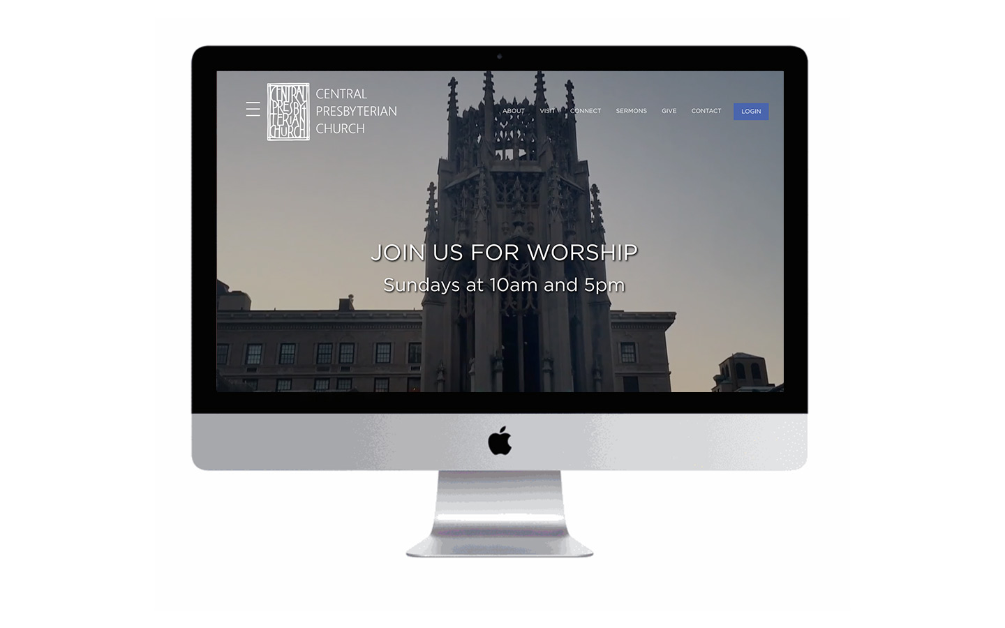
NAVIGATION
The goal was to enhance the clarity of the site and allow content to be discoverable in the proper context. To do this, within each top level section, I created a secondary navigation bar to easily access all the sub-pages. Adding quick access buttons to pages with multiple states, such as events, divided into weekly and recurring, allowed users to easily access these in a context appropriate way.
By simplifying the navigation, and providing content in the proper context dramatically reduced confusion for users and allowed for a more straightforward and controlled path.


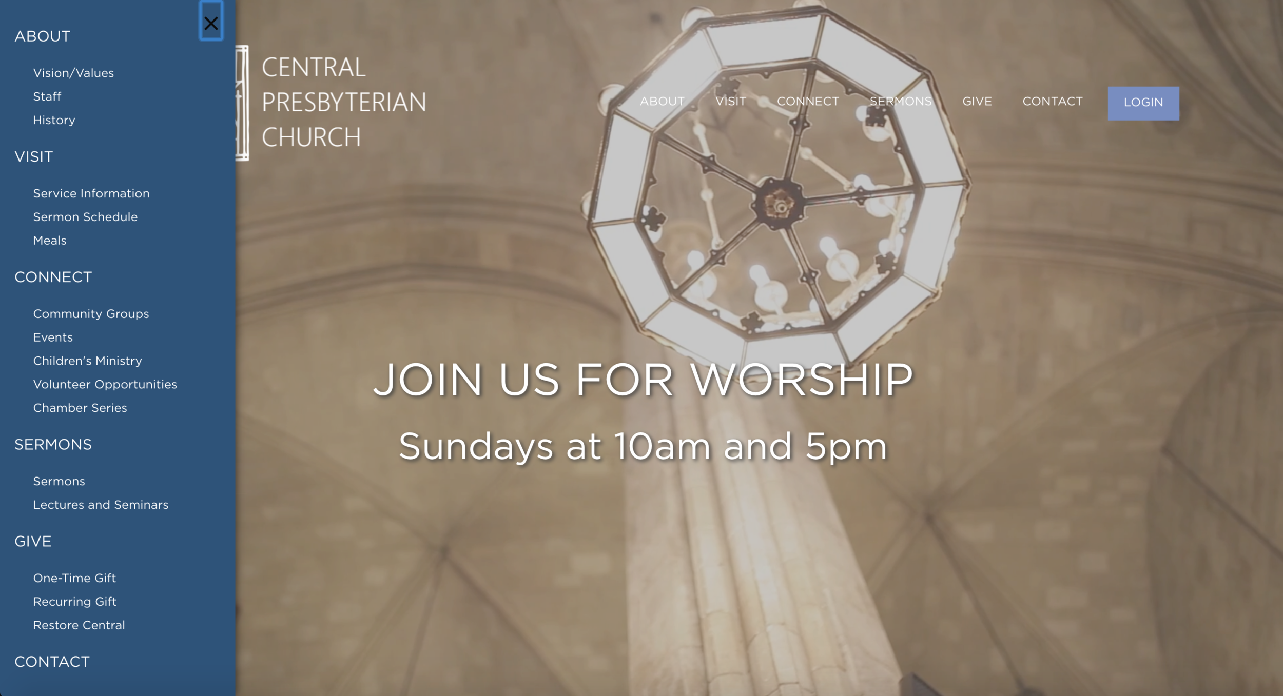
I also incorporated a mega menu for more experienced users to quickly access a specific page at a glance. Giving users multiple options for accessing information is important. But it must be done with immense care and intention.
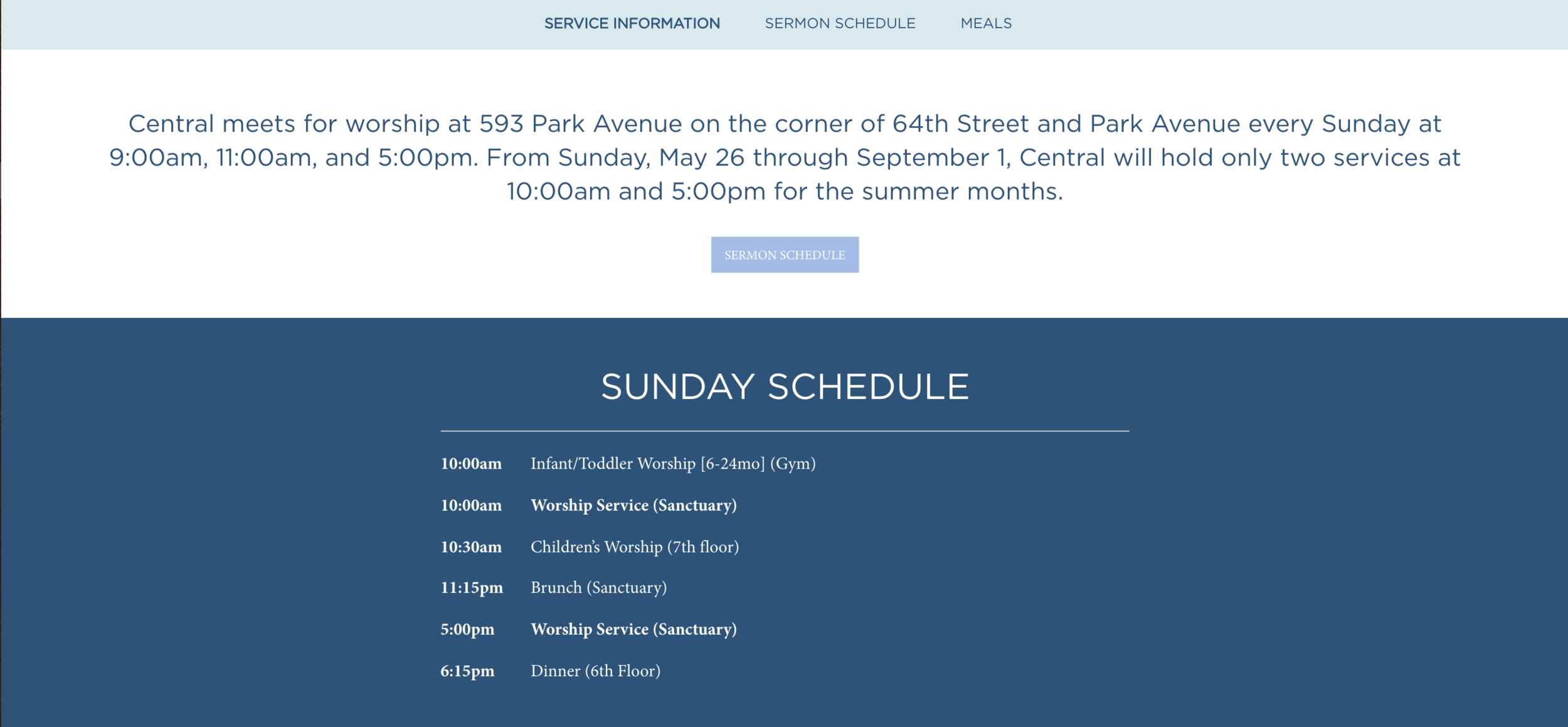
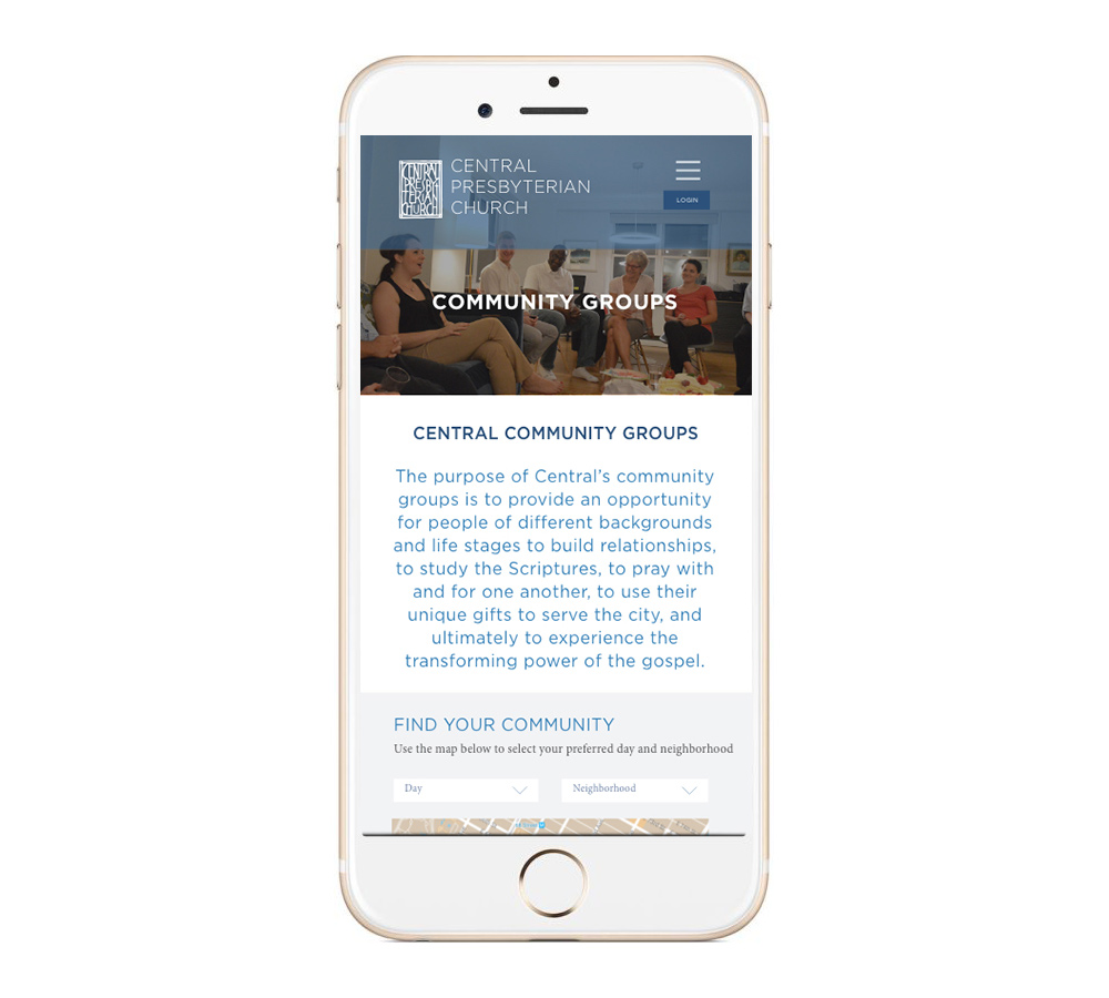
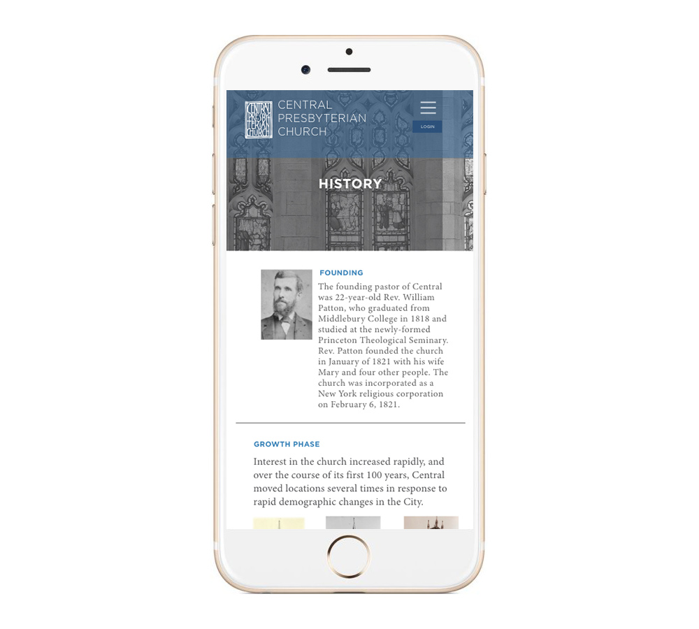
CONTENT STRUCTURE
How content is laid out, dramatically impacts how users engage and process the information. The old site had some trouble with the content structure, some pages users were overwhelmed with lots of content, while others did not provide enough useful information to make a decision or inspire an action.
The goal with the new site was to create pages that gave concrete information in smaller pockets of space to help in the visibility and ability to digest relevant content. Intentional typographic choices also aid the user and establish a more clear hierarchy of information.

Excerpt from the home page, breaks down elements into short sections

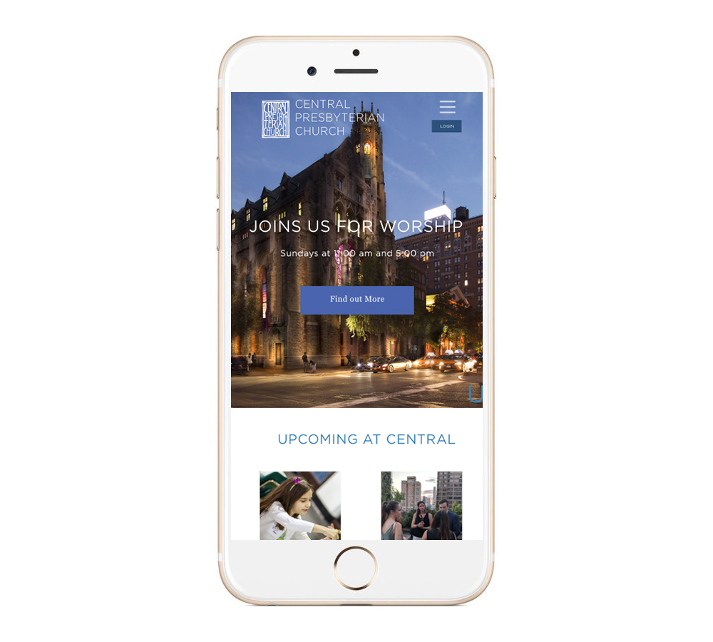
MOBILE DESIGN
One other major design element that needed to be addressed in the site redesign was to ensure the site was responsive and optimized for mobile. Many new congregants were digital natives and needed to access the site from their phones. Providing a cohesive experience across all devices was an important design consideration. Whether users were accessing information about the service on Sunday, or signing up for a social event, the action should be just as simple and straightforward on a phone as on a computer.

THE RESULTS
The impact of the new site design has been impressive.
Here are the metrics measuring the results.
Users
878% percentage increase
in users from August 2018 to July 2019
Average time on page
increased from 12 seconds in August 2018 to 1:39 in July 2019
Page views
increased from 202 in August 2018 to 5024 in July 2019
Key Takeaways
This project really showed me the importance of planning and research upfront. Defining the structure and managing the scope of the content was one of the keys to the site’s success. We had a small team, but were able to produce a large amount of work on a tight deadline because we prioritized clear communication and delegating responsibilities.
Keeping in mind the end user and coming back to what information would be most crucial for them really helped define the copy and content and also helped us prioritize page builds. Getting feedback from users also helped refine the navigation nomenclature, making it more straightforward.